“Take a piece of work you’ve seen from us, and using our team’s feedback framework (what works and why // what could be better and why // an idea for next time) give us a critique! Probably goes without saying, but make sure to let us know which piece you’ve chosen, too!”
Let’s start with the “Our Impact” page.
What works: The page. It’s important. It informs the visitor (whether it’s a customer, a member of the press, or a job-seeker) not only of your company’s values, but also what you’ve done to make a difference in the world.
What could be better:
I’m not sure why there’s a thick purple line between “read our latest impact update” and “Wait, toilets?” I don’t see this color anywhere else on the website. I’d recommend keeping the colors to the company’s signature blue and the occasional magenta as an accent.
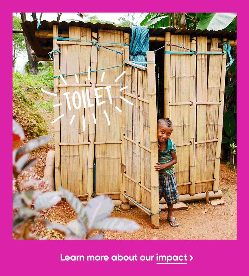
It would be great to see another “Did You Know?” block (one is too lonely). I’d put:
Did You Know?
2.3 billion people (40% of the world’s population) have no toilet. Poor water and sanitation cause diarrheal diseases that kill 800 children per day, or one child every two minutes. That’s 289,000 children every year.
Blocks of texts are good and informative, but they could be better with bold and italics to draw the reader’s attention so they can get the gist faster.
An idea for next time:
Not gonna lie: I accidentally skipped the donation report on the top of the page and spent two minutes looking for the report and transparency. Then when I actually found it and clicked on the link, I saw a delightful and really eye-catching video with an animated header. The video and the $490,000 should be on top of the “Our Impact” page, with the hyperlink button to the actual PDF report that shows the company’s transparency on how the money’s used.
I’m a big proponent of animated gifs, and this article from Litmus.com seems to approve their usage in marketing emails, but why stop there?
I’ve created simple animated gifs for Who Gives a Crap’s “Our Impact” page to make it more eye-catching.


The second is the welcome email.
What works:
The email is short and sweet, which means it opens on all devices without being truncated. The big, bold letters are eye-catching and informative.
What could be better:
When one clicks on “Here’s Why You Should Get Behind Us,” instead of being directed to the front page, it would be better to have it go to “Our Impact” page. And instead of 50% of profits donated, great value, and made without trees, it would be better to use the good for the world/people/bum like on the front page so there’s a repeated message and consistency. These three goods should also be repeated in the “Our Impact” and “About Us” pages.
I’d also put the impact update video in the welcome email, with a link to the update page.
And yes, I’ve also created an animated gif: